PERRIER OFFICE DESIGN
– A REFRESHINGLY UNIQUE EXPERIENCE –
CASE STUDY
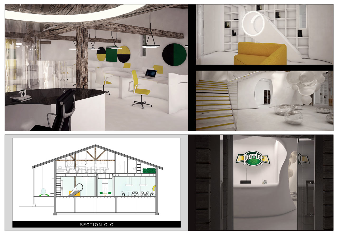
Daring, Elegant, Sexy, Playful, Artsy & Cutting Edge – These words sum up the character of the Perrier brand and its logo. Undertaking of this project was to design a workplace for the marketing department (20 people), that would reflect the company’s dynamic culture and tell the brand’s story. Much emphasis was placed on letting in adequate natural light into the previously dark rooms, providing an open space with flexible workstations; efficient sound isolation for video conferences; and sustainable green solutions of the building.
Based on the client’s aesthetic and functional requirements, we came up with a DNA bubble design concept, which gracefully incorporated the soft curves of the Perrier logo and the brand’s color scheme. The combination of these features creates a relaxed atmosphere, encouraging employee’s creativity and productivity.
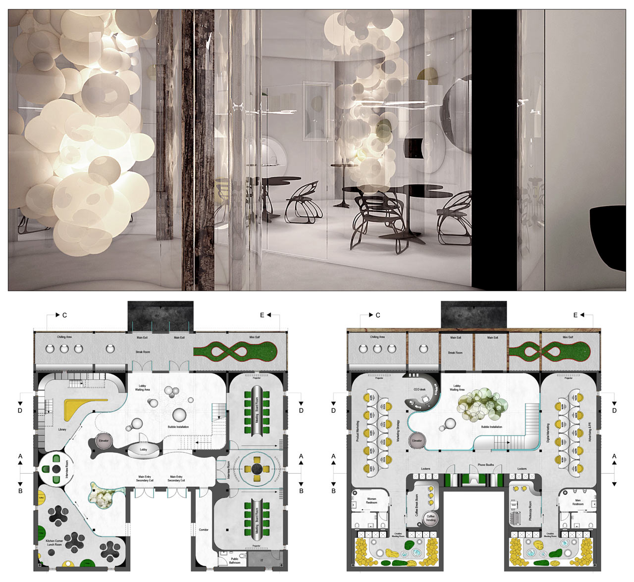
Once you step inside the building you immediately see a bespoke organic-shaped reception desk. On the left is a custom-made kitchen corner, an interview room and library. When you cross the lobby, which is lit by a bubble light installation, you enter a multifunctional board room that can be easily divided into three smaller separate meeting rooms. The second level is devoted to workspace for each department, and includes the CEO’s desk with a view of the lounge on the left.
THE PROJECT INCLUDED
An extensive marketing research, a mood board, a concept board, floor plans, reflected ceiling plans, electrical plans, 5 sections, 3D renders
FLOOR PLAN
434 m2


